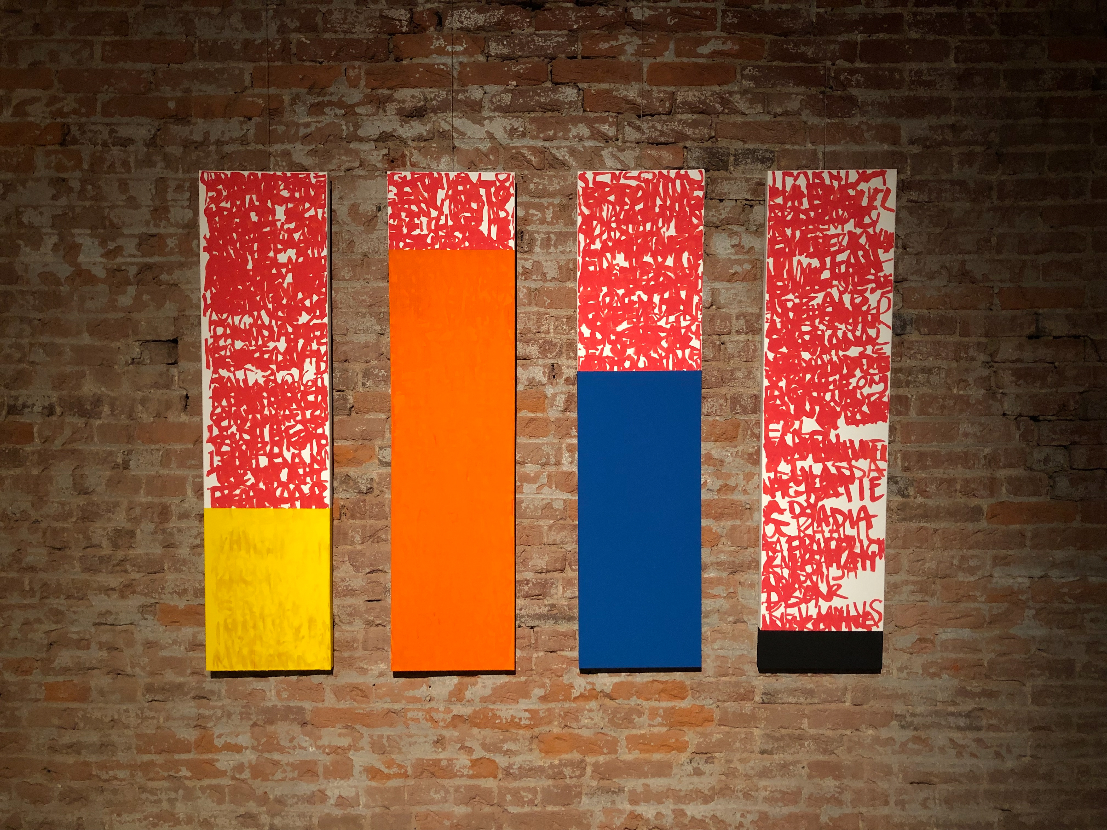
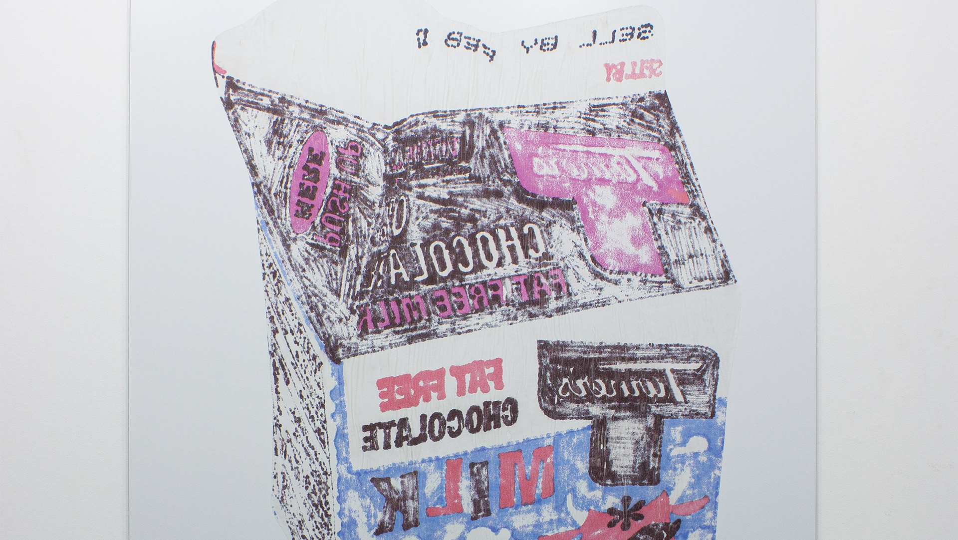
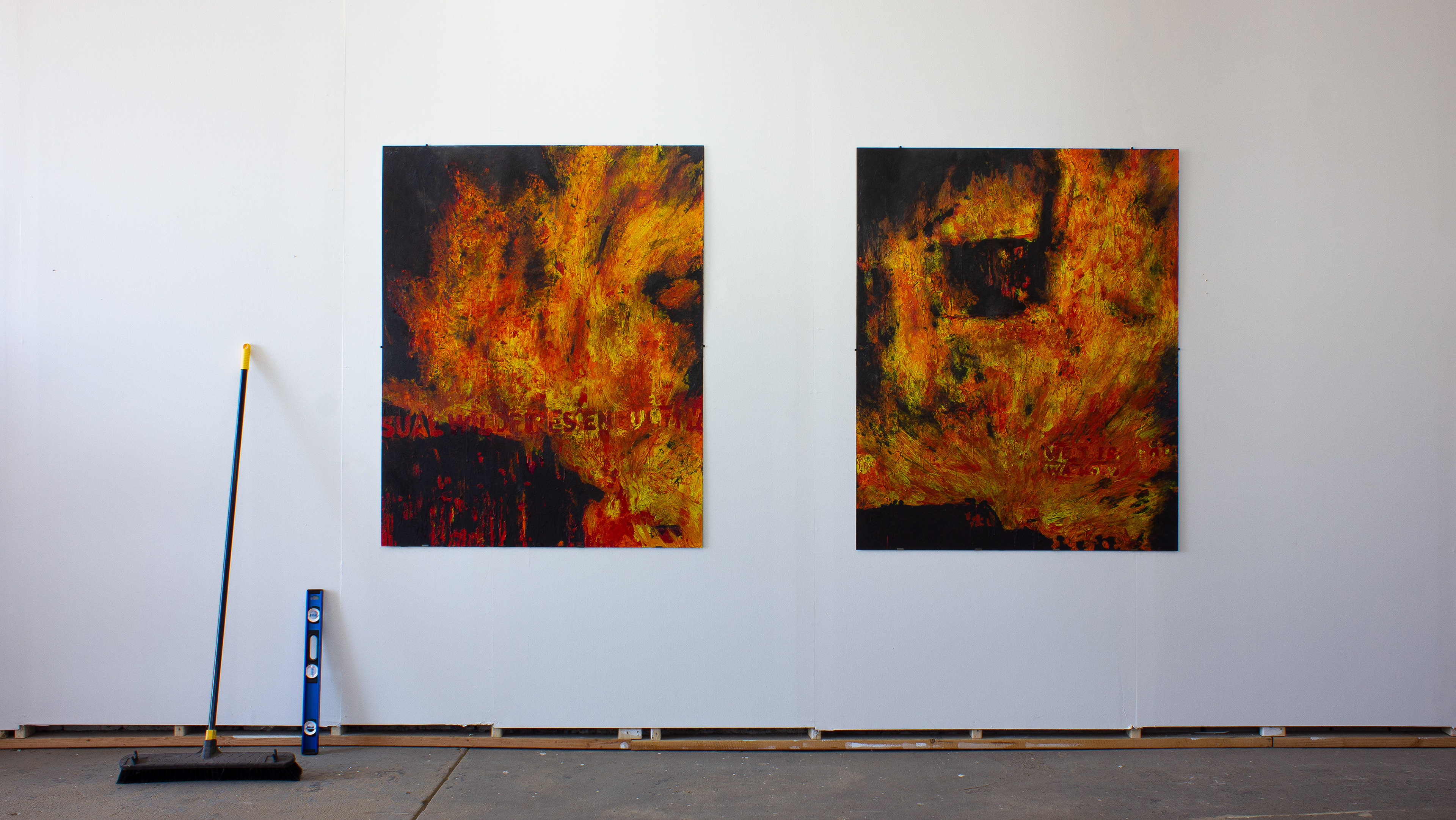
I am confronted with a lot of data, artistically and educationally, throughout my practice. I sometimes play with data visualization ideas or I use the information the inform the work that I do. Each painting in this 4-part work represents a different data topic in the form of a percentage bar graph. This is real data from a real Pittsburgh-area school. Shown from left:
% ESL in the school
% Considered economically disadvantaged
% Who qualify for a meal program*
% percentile rating relative to the quality of education it offers it's student when compared against Pennsylvania as a whole
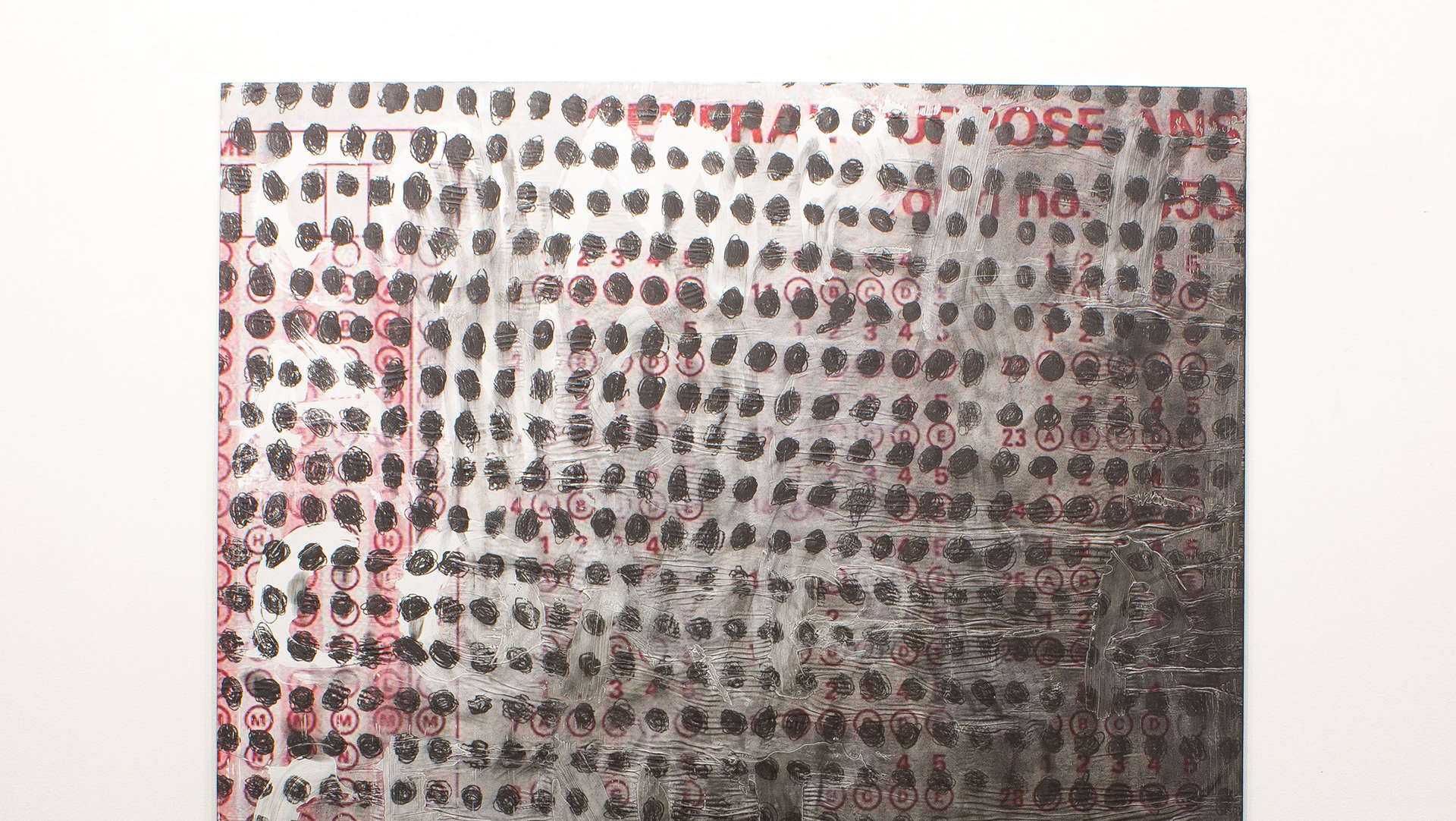
% Considered economically disadvantaged
% Who qualify for a meal program*
% percentile rating relative to the quality of education it offers it's student when compared against Pennsylvania as a whole
*because 80% of the student body in the district qualified for a free/reduced lunch, all students in the district qualified for the meal program